Land, Water, and Climate Change in Five Interactive Maps

The “edge” between land and water heavily influences the way we organize ourselves and our activities geographically. Access to potable water is vital to human survival on a biological level. However, we also derive immeasurable cultural, economic, environmental, and aesthetic value from our coastlines, streams, and wetlands. Historically, many of society’s most celebrated accomplishments required a robust understanding and management of the transitional boundary between land and water and, arguably, many of society’s greatest mistakes stemmed from a failure to adequately conceptualize and govern this boundary (Edge Effects’ own Adam Mandelman has captured many of these watery problems and possibilities at Porous Places).
Importantly, the “edge” between land and water is dynamic—despite our investment in armoring it—and it is this dynamism that makes our relationship to coastlines, streams, and wetlands particularly susceptible to the changing climate. Drawing upon the best climate science and modeling available, the Intergovernmental Panel on Climate Change projects a prominent increase in global mean temperatures during the 21st century, with projected temperature and precipitation changes varying considerably by geography. Changes in global temperature and precipitation could substantially disrupt the Earth’s distribution of water, both on our land and in our seas. For example, the most extreme IPCC projection suggests a global sea level rise exceeding 6 feet by 2100 due to ocean warming (causing water expansion), the loss of polar ice sheets, and glacial melt. Such a “worst case scenario” increase in sea levels would dramatically transform coastal communities and habitats.
Maps are a powerful means for communicating information about complex geographic phenomena and processes, such as climate change and the impacts it will have on land and water. When designed correctly, such maps make climate science and modeling more accessible to policymakers and citizens, empowering these groups to inform their discussions and decisions with the best available information. When online and interactive, these maps act as exploratory “what-ifs” for linking historical water levels to future projections and supporting adaptive management of overland erosion, habitat degradation, storm flooding, and water quality hazards. When based on high-resolution data, these maps enable policymakers and stakeholders to relate global patterns to the regional and local context, promoting a nuanced understanding of future conditions at the “edge” of land and water. Finally, by textually and graphically augmenting quantitative data visualizations, these projects bridge the sciences and humanities, helping to explain and demystify climate science and modeling.
What do maps effectively communicating the consequences of climate change look like? I recently worked with the National Oceanic and Atmospheric Administration (NOAA) and the University of Wisconsin-Madison Sea Grant Institute to design the Lake Level Viewer, a map-based visualization of the future “possibility space” for each of the five Great Lakes coasts of North America. In contrast to rising sea levels, prevailing thought in the scientific community is that warmer temperatures and decreased ice cover will drive a trend toward lower Great Lakes water levels, although the actual long-term impact on lake levels remains unclear. The water levels across the Great Lakes already set or approached record lows in 2012-2013 and are becoming increasingly variable year-to-year. As part of the design of the Lake Level Viewer, we critically reviewed a growing set of interactive maps depicting the impact of climate change on the global water balance. Below, I share five maps from this review (including the Lake Level Viewer). Each illustrate effective or novel map design solutions that can improve our understanding and management of the transitional boundary between land and water as it responds to a changing global climate.
____________________________________
1. Sea Level Trends

Sea Level Trends: Nearly all water level stations in the U.S. have observed an increase in sea level, several approaching a centimeter a year (e.g., Eugene Island, LA, depicted above). The few stations observing decreased levels have experienced tectonic activity, causing a change in elevation in the water level station itself.
NOAA’s Sea Level Trends interactive map depicts observed changes in mean sea level at 128 US and 240 international water level stations, allowing exploration of sea level trends at the global scale. The historical record extends beyond 100 years at some US stations, demonstrating the potential of pairing actual historic observations with model-derived future projections when investigating and communicating the impact of climate change on future water levels. The historical record also provides evidence that we already are in the midst of global climate change, and that the question most scientists are approaching with their model projections is not if the climate will change in the long-term, but to what degree it will change in the short-term.
The map represents the sea level trend with a colored arrow of varying length anchored to the station location. Users can retrieve the complete historical record by clicking on a station arrow. For many of the stations, the linear trend is projected into 2020. The ability to use the tool for local discussion and decision making is somewhat restricted, however, given the mapping of water level stations without additional context. Therefore, the Sea Level Trends interactive map is best paired with one or several of the interactive maps discussed below in order to relate global patterns to a local context.
2. Surging Seas
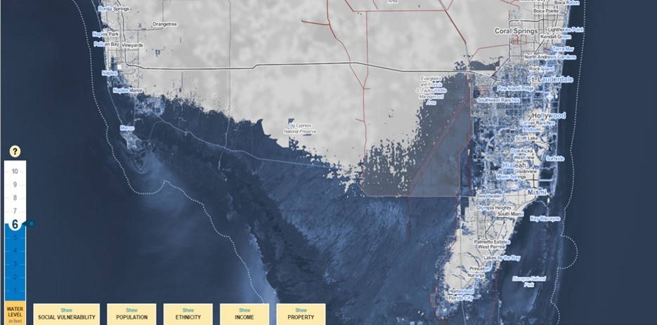
Surging Seas: A “worst case scenario” increase of 6 feet will inundate much of the Everglades of Southern Florida, an important habitat for plants and animals living on the edge of land and water. Storm surges up to 10 feet could convert the Miami metropolitan area into an archipelago.
The Surging Seas interactive map—created in partnership by Climate Central and Stamen Design—allows users to plot hypothetical floods up to 10 feet along the complete Atlantic, Gulf, and Pacific coasts of the United States using high-resolution land elevation data derived from LIDAR. While the 10 foot maximum is beyond the most extreme IPCC projection of ~6 feet for 2100, it captures the possibility of intermittent storm surges, getting closer to the “worst case scenario” for flood hazards resulting from climate change. Model-derived projections can be viewed for a small set of selected locations through the “forecast” tab, presented as the likelihood a flood event of a particular size will occur at the selected location by decade from 2020 to 2100.
Surging Seas uses a novel solution for representing the land-water edge, showing flooded areas in high detail and areas remaining dry in low detail, thus directing the user’s attention to locations with a growing flood hazard. Surging Seas also includes advanced functionality to support discussion and decision making. Users can replace the detail map of simulated flood zones with a social vulnerability index, as well as demographic, socioeconomic, and property value information, all of which promote public debate about the ways in which climate change—and local mitigation strategies—may impact marginalized populations disproportionately. Users also can employ the “analysis” and “comparison” features to explore the ways in which a given place relates to the broader regional context and stacks up against other local contexts.
3. SLAMMView

SLAMMView: An increase of 0.7 meters by 2100—predicted under the IPPC Scenario A1B Maximum—would transform coastal habitats. The above image depicts the current and projected habitat at Pea Island National Wildlife Refuge along the Outer Banks of North Carolina, an important nesting habitat for migratory birds.
SLAMM (Sea Level Affecting Marshes Model) is a coastal land cover model encapsulating five processes that define the land-water edge: inundation, erosion, overwash, saturation, and accretion. The SLAMMView interactive map—created through a public-private partnership led by the U.S. Fish and Wildlife Service—displays the results of studies employing SLAMM, and thus has only partial coverage of the United States coast. Users are able to drill into a study location using the “Projects” and “Regions” tabs and then calibrate the inundation component of SLAMM by selecting one or more models in the “Scenarios” tab, which includes IPCC models for most studies. Users then are able to generate maps depicting projections from the chosen model for 2025, 2050, 2075, and 2100 using the “Years” tab.
The design of SLAMMView is noteworthy in two ways. First, it enables users to visually compare different model configurations using the “Comparisons” tab. For the same study area, users can compare multiple sea level rise models of the same year, or multiple yearly forecasts of the same model, both of which help stakeholders understand the sensitivity and uncertainties associated with model-derived projections. Second, SLAMMView provides a wealth of information about projected conditions at the land-water edge. After selecting a location and scenario, the “Analysis” tab is populated with a high resolution land cover projection from SLAMM that visualizes multiple land cover categories falling between dry land and open water (e.g., beach, swamp, marsh, tidal flat). With such detail, SLAMMView enables rich discussion and decision making about habitat destruction, protection, and restoration.
4. Coastal Resilience Mapping Portal

Coastal Resilience Mapping Portal: Highly exploratory “what-if” interfaces help policymakers and citizens understand potential futures. The above image shows flooded developed land (in black) in New York City under one “what-if” scenario, a hypothetical future that can be compared directly to past events, such as Hurricane Sandy.
The Coastal Resilience Mapping Portal is the geographic face of the Coastal Resilience network, a consortium of agencies and practitioners working in coastal areas led by The Nature Conservancy. The Coastal Resilience Mapping Portal includes both a “Global” interactive map providing comparative global statistics regarding coastal resilience, as well as detailed interactive maps at select locations in the Caribbean, Mexico and Central America, and the United States. The detailed maps load several of the data layers provided through Surging Seas and SLAMMView, allowing visual comparison, as well as additional layers relevant to community planning, such as the geographic extent of shoreline armoring.
The Coastal Resilience interactive maps fully support open-ended, “what-if” exploration. For exploring the magnitude and extent of sea level rise, users can adjust the hypothetical amount of sea level rise and view model-based projections for 2020, 2050, and 2080. For exploring how sea level rise might degrade habitats, users can weight a series of environmental and socioeconomic variables. Like SLAMMView, the Coastal Resilience Mapping Portal also supports side-by-side comparison of different model parameters using the “Split View” feature.
5. Lake Level Viewer

Lake Level Viewer: The potential decrease in future water levels across the Great Lakes will have a significant impact on coastal communities, as land exposure will require channel dredging and breakwater relocation to maintain marinas and ports, among other infrastructure and habitat concerns. The above image depicts an expanded beachline under a decrease of 6 feet near a marina in Michigan City, Indiana.
The NOAA Lake Level Viewer introduced above is a companion interactive map to the NOAA Sea Level Rise and Coastal Impacts Viewer (not discussed here, but worth exploring), updated for the Great Lakes context. Because each of the Great Lakes has a unique long-term average elevation and natural range—aside from Huron and Michigan, which form a continuous water body—the user first must select a lake to calibrate the base water level for the visualization. Users then can adjust the water level by “filling” or “draining” a widget designed as a glass vessel (a natural metaphor for measuring water levels). Given the infancy of regional climate models specific to the Great Lakes context, the Lake Level Viewer does not include model-derived future projections like SLAMMView and the Coastal Resilience Mapping Portal.
The Lake Level Viewer has three notable differences in the map design compared to its peers. First, projecting the water balance for many inland contexts requires data and maps that account for the way in which an area may be intermittently exposed as land and then inundated (and vice versa), in order to fully capture the dynamism of the land-water edge under changing climates. The Lake Level Viewer uses high resolution topobathy LIDAR for near-offshore elevations—resulting in a seamless digital elevation model between land and water—and then a blue-to-brown color ramp to represent inundation and exposure, respectively. Second, the Lake Level Viewer provides a spatial measure of confidence that a given location will be inundated or exposed, enabling stakeholders to weight the inherent uncertainties in the underlying data as they discuss and decide upon mitigation strategies. Finally, the shoreline on the map is dotted with camera icons that activate photo simulations of potential inundation and exposure from the NOAA CanVis tool. Such photo simulations provide concrete visual examples of projected changes to the land-water edge.
Robert E. Roth is an Assistant Professor of Geography at the University of Wisconsin‒Madison, where he researches and teaches cartographic design, interactive and web mapping, and geographic visualization. Design of the Lake Level Viewer, and the associated critical review of existing water level maps, was supported by the U.S. National Oceanic & Atmospheric Administration through Award #167152. Additional details about the study are available here.
You must be logged in to post a comment.